We welcome you to
JOX-A Design Studio
To engineer change and create the greatest experiences for our customers and consumers, we mix research-driven strategy, imaginative design, and clean code. To engineer change and create the greatest experiences for our customers and consumers, we mix research-driven strategy, imaginative design, and clean code.
The graphic designers at JOX-A Design Studio are well versed in the global economy that Portland hosts and they will provide a design that is both eye-catching and effective. Jox A Design Studio’s highly gifted designers can produce a logo or other piece of visual art that effectively communicates your brand’s message at a single glance.
")
Whether you’re starting from scratch with a new site or just want to make some minor tweaks to an existing one, our WordPress professionals are here to assist you in every way possible.
Each project is one-of-a-kind since it has its own set of prerequisites and characteristics. Each project below has its unique objectives, prerequisites, and difficulties.
All of this was completed thanks to the cooperative effort, innovative thinking, and copious amounts of caffeine. Our goal is to become a dependable partner for clients all over the world by adding aesthetic and technological value to their projects.
Ignite your design journey with a fusion of contemporary flair and inventive concepts, exploring modern web design inspirations and ideas that promise a distinctive online presence.
Ease of Use
WordPress is the most popular content management system (CMS) for both personal and business websites in Portland, OR due to its ease of use and scalability. We go the extra mile to make it simple for you to implement your customizations.
Inviolable, modern, & risk-free
Building Long Term Relationships
We’re all in this together, therefore we provide continuous assistance for our customers. We’ll answer your call or reply to your email within minutes, not days. SPEAK UP

Latest Posts

How to Pair Serif and Sans Serif Fonts on Websites: 7 Combinations That Actually Work
Pairing a serif with a sans serif sounds simple until you actually open your design tool and stare at 1,400 Google Fonts. Most articles stop at vague advice like create contrast or look for variation. That is not enough when you are shipping a real website with real...

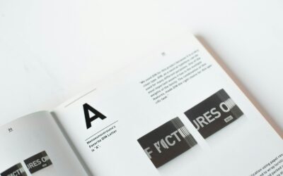
Bauhaus Typography Style: How the Movement Shaped Modern Type Design
What Is Bauhaus Typography Style? The Bauhaus typography style is one of the most influential design movements of the 20th century, and its fingerprints are still visible across branding, web design, and digital interfaces in 2026. Born out of the Bauhaus school in...

What Is X-Height in Typography and Why It Matters for Readability
What Is X-Height in Typography? If you have ever placed two fonts side by side at the same point size and noticed that one looks noticeably larger than the other, you have already experienced the effect of x-height without knowing it. In typography, the x-height...

Top 7 Web Design Best Practices to Increase User Engagement in 2024
With the rapid evolution of technology and user expectations, web design is no longer just about making a site look good—it's about crafting experiences that keep users engaged and drive conversions. In 2024, user-centric design is more crucial than ever. Whether...
5 Tips for Using Typography to Enhance Website Design and User Experience
Choosing the right typography for your website is like picking the perfect outfit for an interview: it sets the tone, conveys a message, and leaves a lasting impression. Typography in web design goes beyond just making words legible; it shapes the user experience,...
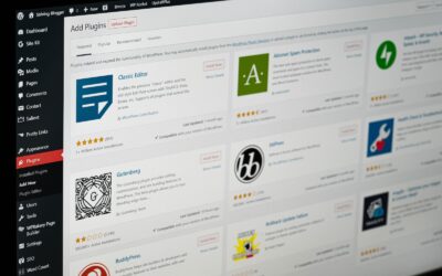
Tools, Tutorials, & Best Practices for WordPress Development
WordPress can enable all to develop an inspiring and appealing website without skills and experience. Many consider hiring web developers for their WordPress development. However, you can do it with a bit of research. The key is using the right tools and following the...

Web Design Trends In 2022 You Should Consider
The web design industry is constantly evolving and what was popular last year may not be so popular this year. This is why it's important to stay up-to-date on the latest trends so you can ensure your website is always on trend. Here are some of the web design trends...

The Rise Of NFTs And Why Graphic Designers Need To Take Notice
NFTs are a hot topic in the world of cryptocurrency and blockchain right now. Since mid-2021, NFTs have taken the world by storm. While the hype has died down for a bit, there’s still a lot of buzz around them that would make a lot of people very interested. But what...