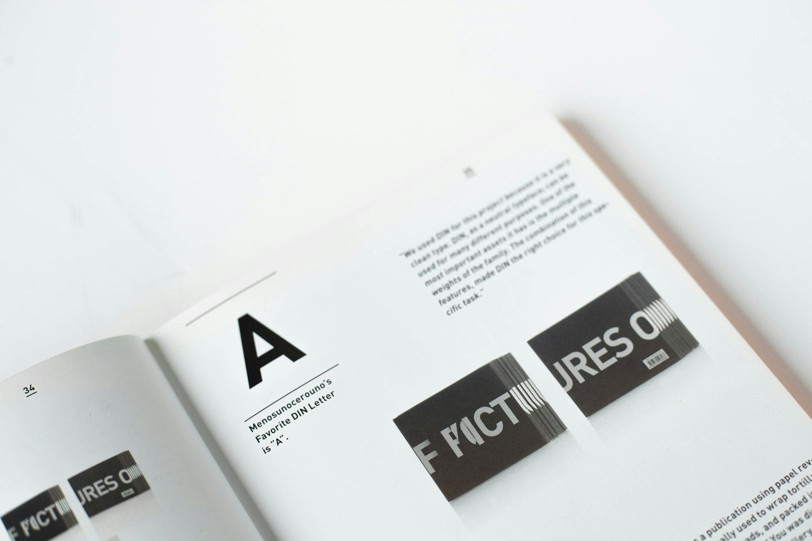
Choosing the right typography for your website is like picking the perfect outfit for an interview: it sets the tone, conveys a message, and leaves a lasting impression. Typography in web design goes beyond just making words legible; it shapes the user experience, reinforces your brand identity, and can even influence visitor behavior. Here are five essential tips for using typography to enhance your website design and elevate the user experience, ensuring every word on your page works towards your business goals.
1. Prioritize Readability and Accessibility
At its core, typography must make reading effortless and enjoyable. This means selecting typefaces that are easy on the eyes across different devices and resolutions. A good practice is to stick with high-contrast color combinations, such as dark text on a light background, to ensure maximum legibility. Additionally, pay attention to font size, spacing, and line length. For optimal readability, aim for a line length of between 50-60 characters, and use ample line spacing to prevent text from appearing cramped. Ensuring your typography adheres to accessibility standards not only improves user experience but also broadens your audience reach.
2. Create a Visual Hierarchy
Effective typography guides visitors through your content in a way that feels natural and intuitive. Establishing a clear hierarchy with your text helps users quickly grasp the structure of your content and navigate to the most pertinent sections effortlessly. Use varying font sizes, weights, and styles to differentiate between headings, subheadings, body text, and calls to action. For instance, larger, bolder fonts can draw attention to headlines, while a distinct style or color can highlight important calls to action. This strategy not only enhances the aesthetic appeal of your site but also boosts its functional layout.
3. Choose the Right Typeface for Your Brand
The typeface you select speaks volumes about your brand’s personality. Whether it’s a traditional serif font that suggests reliability and respectability, or a sleek sans-serif that conveys a modern and clean look, ensure your choice aligns with your brand’s identity. Consider the context in which the type will be used and the emotions you wish to evoke. For a cohesive brand experience, maintain consistency in the typefaces used across all your digital and physical marketing materials. This consistency helps reinforce brand recognition and fosters trust with your audience.
4. Consider Font Performance
In the digital age, the performance of your website is paramount. Some fonts, especially those with numerous weights and styles, can significantly slow down your site. Opt for fonts that are optimized for web use, known as web-safe fonts, and be mindful of the number of font families you incorporate into your design. Tools like Google Fonts provide a wide range of optimized fonts that can enhance your design without compromising load times. Remember, the quicker your site loads, the happier your users will be.
5. Experiment with Responsive Typography
Just as your website layout adjusts to different screen sizes, your typography should too. Responsive typography adjusts to screen size and resolution, ensuring a seamless reading experience across all devices. This might mean larger fonts for mobile devices to compensate for smaller screens, or different alignments and spacing for tablets. Responsive typography not only improves readability and usability but also shows that your brand values user-centric design.
By incorporating these typography tips into your website design, you transform plain text into a powerful design element that enhances both aesthetics and functionality. Typography is not just about choosing beautiful fonts; it’s about creating an environment where content shines, interactions are intuitive, and the brand’s message is clear and compelling. Invest time in refining your typography strategy, and watch as it lifts your website from ordinary to extraordinary, captivating users and conveying your brand’s story with every word.

